The man who wanted to be a machine
The center of the American wave is Andy Warhol. Before he was a fine artist he was a hugely successful commercial illustrator, drawing shoe ads, and he never pretended to outgrow it. The commercial world was his subject and his method, and he flattened the wall between the two on purpose. In 1962 he made the work that is shorthand for the whole movement, and it could hardly be more ordinary: thirty-two paintings of soup cans. Campbell’s Soup Cans is thirty-two separate canvases, each under two feet tall, each a single can, one per variety the company sold. First shown at the Ferus Gallery in Los Angeles, propped on a thin shelf running around the wall exactly the way cans sit in a grocery aisle. That is the entire gesture, and it is enormous: the supermarket walks into the museum and hangs where a Rothko hung. No feeling on display, no brushwork to admire, no story. Just the can, and then the can again.


Warhol was as deadpan as the work. In interviews he answered with “yes,” “no,” and “I don’t know,” insisting there was nothing behind the surface and that if you wanted to know him you should just look at the surface of his paintings, and there he was, with nothing behind it. Then he industrialized the art itself. He switched to silkscreen (a printing technique that pushes ink through a stencil mesh to lay an image down fast and identically, over and over, the same process used for commercial posters), set up a studio he called the Factory (a real silver-foiled loft, and the name is the point: a place where art is manufactured, not agonized over), and turned out work in editions. When Marilyn Monroe died in August 1962 he made Marilyn Diptych, fifty silkscreened Marilyns from one publicity still, the left half in hot color, the right fading to smeared grays until she nearly disappears: celebrity, mass reproduction and death at once, the star copied until she wears out. Asked why he worked this way, in a 1963 interview, he gave the movement’s motto, at least as it was printed at the time: “I want to be a machine.”

The most provocative thing Warhol made was a box. In 1964 he showed the Brillo Boxes: plywood boxes silkscreened so carefully they looked exactly like the cardboard Brillo shipping cartons in any stockroom. Not a painting of a box. A box, indistinguishable from the real thing, presented as sculpture. The question it forced is the one Pop kept asking and never answering: if a work of art is identical to a grocery carton, what makes one art and the other trash? The gallery, the signature, the price, the intention? It put a philosophical bomb under the whole idea of art, with a twist at its center a later chapter returns to: the design Warhol copied was the work of a real, named commercial artist.
Comics, soft giants, billboard scale
If Warhol made art out of the supermarket, Roy Lichtenstein made it out of the comic book, taking single panels from cheap war and romance comics and blowing them up huge in flat primary colors. The signature detail is the dots: cheap comics were printed with Ben-Day dots (a commercial process that builds shades out of tiny evenly spaced colored dots), and Lichtenstein kept them, then painted them by hand through a stencil, faking the look of cheap mechanical printing with slow craft. His Whaam! (1963) is thirteen feet wide: a fighter fires a rocket, the enemy plane erupting in a yellow-and-red “WHAAM!” lettered across the panel. Claes Oldenburg attacked the everyday object by making it huge and soft, his Floor Burger (1962) a hamburger the size of a sofa, slumping under its own weight, the most familiar thing in the world made monstrous. And James Rosenquist, who had painted actual billboards, brought their scale: his F-111 wraps a whole room, eighty-six feet of a fighter-bomber spliced with spaghetti, a tire, and a child under a hair-dryer.
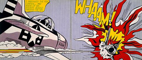
So the manner is complete, and it is the exact opposite of Abstract Expressionism on every axis. Cool, not hot. Flat, not gestural. Mechanical, not handmade (or, in Lichtenstein’s case, handmade to look mechanical). Impersonal, not soul-baring. Outward, at the shared world of the store and the screen, not inward at the artist. The lone genius wrestling his soul onto the canvas has been replaced by a man who says he wants to be a machine, and means it as a compliment.